D3/SVG drawing in Absolute Units
Update, 2014-07-30:
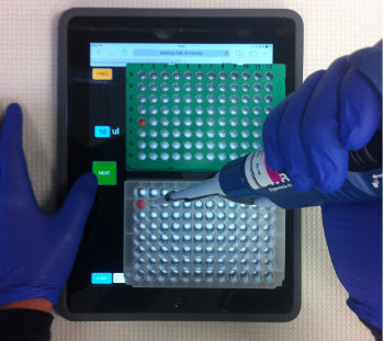
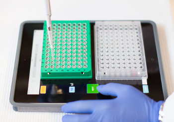
iPipet is published, see Blog Post, Press Release, Bio-IT world story, Nature Methods Correspondence.
Background
To create iPipet we needed a simple method to draw shapes in absolute units - that is, have a known physical size in the real world - so that our plate template would align perfectly on the iPad screen with a 96-Well Plate.
Absolute units work very well in printed documents, but are not recommended when displaying documents on screen (ie. computer monitors). Too many technical factors prevent accurate rendering of absolute units on common screens.
However, when using well-characterized devices whose display resolution is known (e.g iPads), drawing with absolute units is relateively easy.
Screen Resolution on Known Devices
The diameter of this green circle will be 1/2-inch only on specific computer monitors:
← Exactly half-inch green circle, if your display’s resolution is 96dpi
When designing a website for a specific device, the display resolution is usually known in advance. Wikipedia has a list of display densities. In theory, if a display resolution for a device is 132ppi (pixels-per-inch, also known as DPI, dots-per-inch) drawing 132 pixels-long line on the screen will measure exactly 1 inch.
When using HTML/CSS/SVG, we must account for an additional factor: CSS Pixel Ratio.
One of these red bars will be exactly 1-inch wide, if your display’s resolution matches and your device’s CSS pixel ratio is 1:
*CSS Pixel Ratio** enables devices to scale web-pages to a size easily readable by users. It must be taken into account when rendering absolute units. CSS Media Queries trickery can sometimes be used to automatically detect the device’s density and CSS-pixel ratio. Often, it’s easier to ask the user which device is being used (or detect it automatically) and consult wikipedia’s list of known device densities (See ‘Further Information’ below for references).
Using absolute units with SVG
SVG’s ViewBox
attribute is used to specify to logical units inside of the SVG elements. The
syntax is viewBox = <min-x> <min-y> <width> <height>. Here, <width> and
<height> represent the logical left-most and bottom-most positions of the elements
inside the SVG. For brevity, we’ll treat the viewBox coordinates as logical,
absolute units.
Example: The following SVG will be a square measuring 1-by-1 logical units, and inside it, a 0.5-by-0.5 green square and 1-by-0.25 blue rectangle. Note: The size (in pixels) of the SVG element was not defined, so the logical unit size of 1 does not yet correspond to any known size on the device.
<svg id="my_svg" viewBox="0 0 1 1">
  <rect x="0" y=0"    width="0.5" height="0.5"  fill="green"></rect>
  <rect x="0" y="0.5" width="1"   height="0.25" fill="blue"></rect>
</svg>
Next, we’ll specify the size (in pixels) of the SVG element, based on the device display density and CSS Pixel ratio. Since we’ve used logical SVG size of 1-by-1, and we want the SVG to measure exactly 1-inch, the pixel size of the SVG element should be the device density itself (i.e. If the device’s display density is 132 pixels-per-inch, and we want to display 1-inch, the width and height of the SVG element should be exactly 132 pixels. This assumes CSS pixel ratio of 1).
Example: on a 1st/2nd generation iPad with display resolution of 132ppi, the following SVG will measure exacly 1-inch (the green square will measure 0.5-by-0.5 inch, the blue rectangle will measure 1-by-0.25 inch):
<svg id="my_svg" viewBox="0 0 1 1" width="132px" height="132px">
  <rect x="0" y=0"    width="0.5" height="0.5"  fill="green"></rect>
  <rect x="0" y="0.5" width="1"   height="0.25" fill="blue"></rect>
</svg>
← Exactly half-inch green square on iPad 1/2 (132ppi)
Click here for a Demo of SVG absolute units for multiple devices.
Absolute Units with D3
D3 (Data-Driven Documents) is a Javascript library for manipulating documents based on data. Internally, D3 uses SVG. The same principles apply to D3 when rendering absolute units, except with D3, the measurements are usually entered programatically:
<div id="drawing"></div>

<script>
/* Determine proper values at runtime, when the page loads on the device */
var device_width_ppi  = 96 ;
var device_height_ppi = 96 ;

/* Desired size in absolute units */
var desired_width_inches = 1 ;
var desired_height_inches = 1 ;
var viewBox = "0 0 " + desired_width_inches + " " + desired_height_inches ;

/* Data/Elements to draw. Units are LOGICAL (inches) */
var items = [
  { "x": 0,  "y":0,   "w":0.5,   "h":0.5,  "fill":"green" },
  { "x": 0,  "y":0.5, "w":1.0,   "h":0.25, "fill":"blue"  }
  ];

var svg = d3.select("#drawing").append("svg")
  .attr("id","my_svg")
  .attr("viewBox", viewBox)
  .attr("width",  device_width_ppi  * desired_width_inches)
  .attr("height", device_height_ppi * desired_height_inches);

svg.selectAll(".item")
   .data(items)
 .enter().append("rect")
   .attr("class","item")
   .attr("x",     function(d) { return d.x; } )
   .attr("y",     function(d) { return d.y; } )
   .attr("width", function(d) { return d.w; } )
   .attr("height",function(d) { return d.h; } )
   .attr("fill",  function(d) { return d.fill; } );

</script>
Click here for a Demo of D3 drawing with absolute units.
Changing Resolution Dynamically
The following javascript/JQuery code can be used to change the size (in pixels) of an existing SVG object:
function change_resolution(new_ppi)
{
    /* These must match the viewBox size of the SVG */
    var desired_width_inches = 1 ;
    var desired_height_inches = 1 ;

    var new_width_pixels  = new_ppi * desired_width_inches ;
    var new_height_pixels = new_ppi * desired_height_inches ;

    $("#my_svg").attr("width", new_width_pixels + "px");
    $("#my_svg").attr("height",new_height_pixels + "px");
}